
From Drop-off to Discovery: Redesigning WATCHMAN.com
COMPANY:
Boston Scientific
MY ROLES:
-
Visual Design Lead
-
Branding
-
User Research
-
Design System Theming
-
UX/UI
TEAM CREDITS:
-
Catherine Cameron, Sr. UX Designer
-
Jackie Lafuente, Brand Manager
-
Chelsea Price, Product Designer
-
Erin Halling, Communications Strategist
-
Sean Kearney, Sr. Analyst
WATCHMAN, a left atrial appendage closure (LAAC) device from Boston Scientific, aimed to refresh its visual identity and digital presence. Misalignment with the Boston Scientific master brand led to brand inconsistency and confusion among healthcare audiences, undermining brand architecture and market strength. Experience gaps in discoverability and organization made site navigation difficult for browsing, resulting in low engagement and high drop-off rates. The site's contrast for web accessibility also posed barriers for the visually impaired target patient demographic, aged 65 and older.
I led the redesign of WATCHMAN.com to create a more intuitive, accessible platform that would better serve both healthcare providers and patients. The unique challenge: harmonizing simultaneous visual refreshes for both WATCHMAN and Boston Scientific that was accessible, user-friendly, and improved content discoverability. The project brought together teams across UX, product design, marketing, analytics, and senior leadership in a cross-functional effort.
The redesign evolved WATCHMAN's digital presence from a fragmented microsite to a cohesive, design system-driven platform addressing urgent user experience issues and setting a strong foundation for improving user engagement. Some key achievements included:
-
Implementation of WCAG 2.1 AA compliant accessibility standards leading to a 10-point rise in Lighthouse score to 85
-
Development of a dynamic theming system that preserved WATCHMAN's distinct identity while aligning with Boston Scientific's visual language, creating a scalable foundation for future microsites
-
Clear content organization and user pathways that significantly improved engagement metrics
Before & After

Brand Integration & Theming
Preserving WATCHMAN's brand color recognition was of utmost importance to leadership, but WATCHMAN.com was out of step with Boston Scientific's evolving brand and digital presence. Misalignment with the master brand created visual confusion, and a solution was needed to reconcile the two brand updates witihout loosing sight of each brands identity.
A color recognition survey of 250+ participants–comprised of patients, non-interventional cardiologists, and interventional cardiologists –helped provide a baseline on the recognizability of both WATCHMAN and Boston Scientific against other competing brands in the market.


To harmonize the two brands, I developed a dynamic theming system that retained WATCHMAN’s signature orange while aligning with Boston Scientific’s master visual language. A color recognition survey of 250+ participants helped validate brand recognition metrics and informed accessible palette adjustments without compromising identity.

Information Architecture Overhaul
Nearly 75% of visitors relied heavily on the main menu but struggled with unclear terms and an unintuitive structure, leading to circular browsing and highlighting the need for clearer navigation. I collaborated with the WATCHMAN content strategist to define a new information architecture with a logical flow aligned to users' mental models and expectations. Combined with the redesigned navigation, this improved content discoverability and created a more intuitive path across the website's content and services. Testing participants found it easier to locate key pages, and stakeholders reported a smoother flow that better supported their business goals.
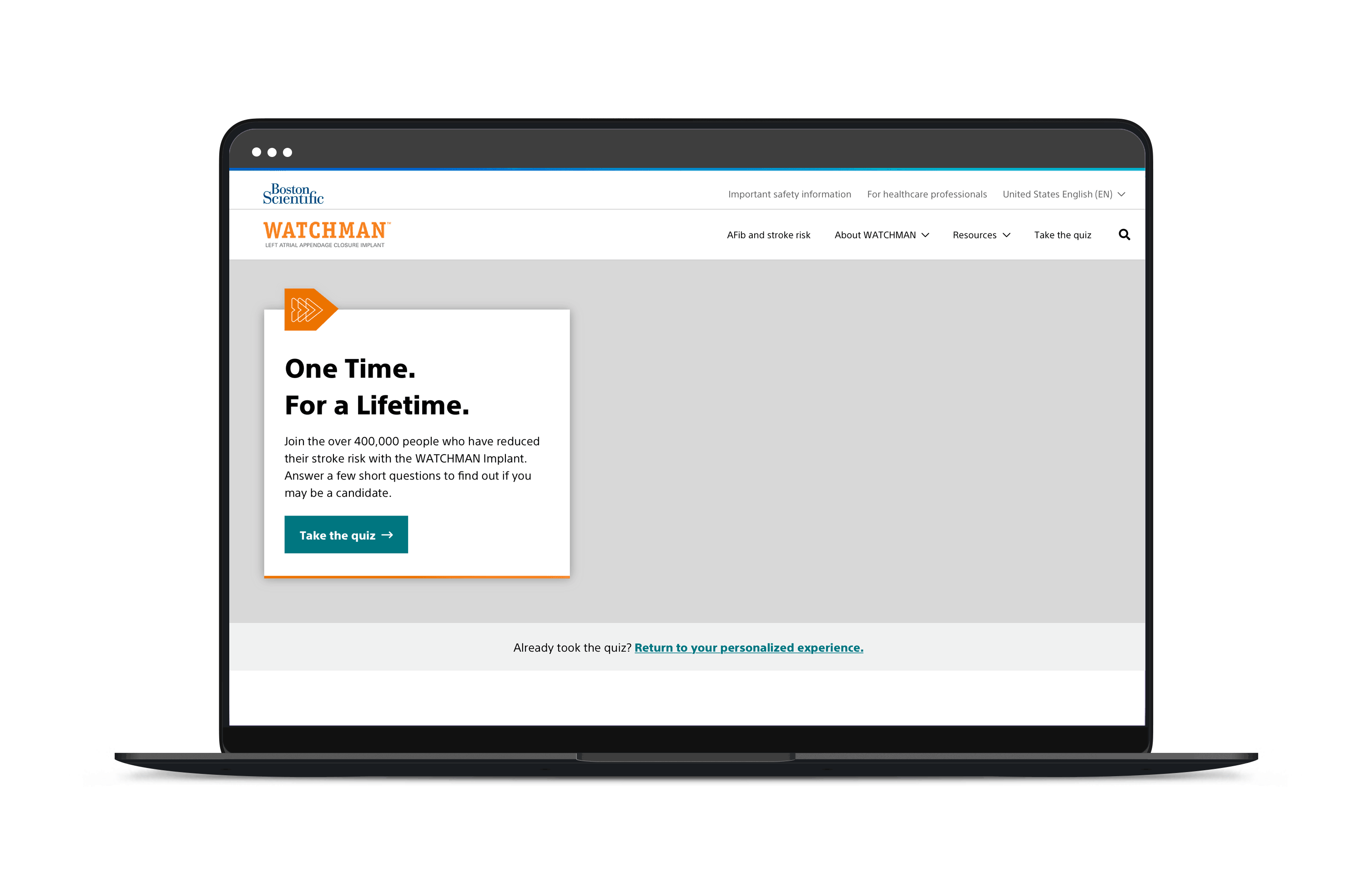

Content Obstruction Solutions
Analytics showed users frequently closed the intrusive sticky quiz window—which blocked critical content like videos—making it one of the most interacted-with but problematic elements on the site. I redesigned a cleaner, unobtrusive alternative that aligned with the platform's modern aesthetic while improving content visibility, setting the foundation for better user engagement.


